
“My New Friend is a Cat”
Webcomic and Social Network Branding Strategies
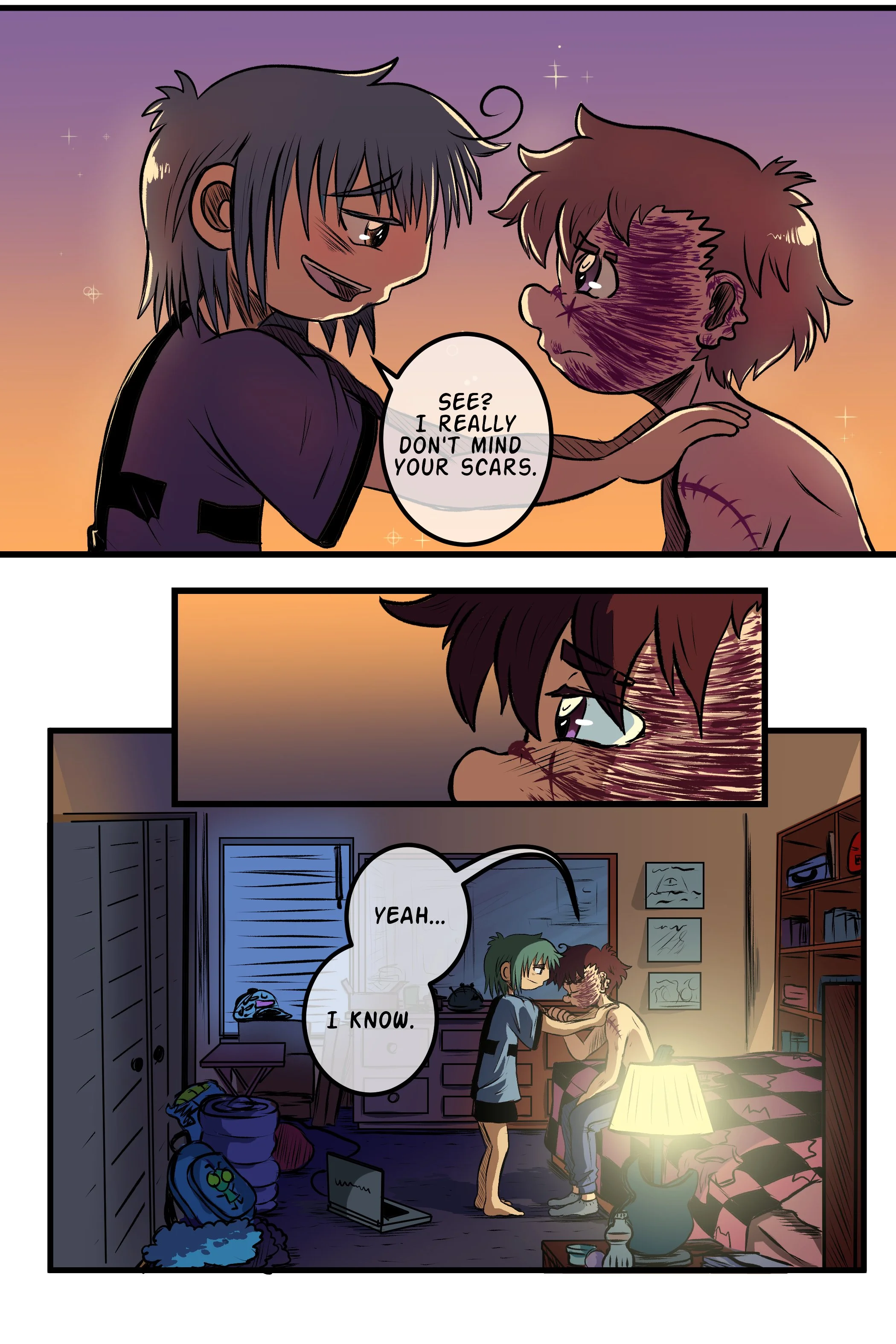
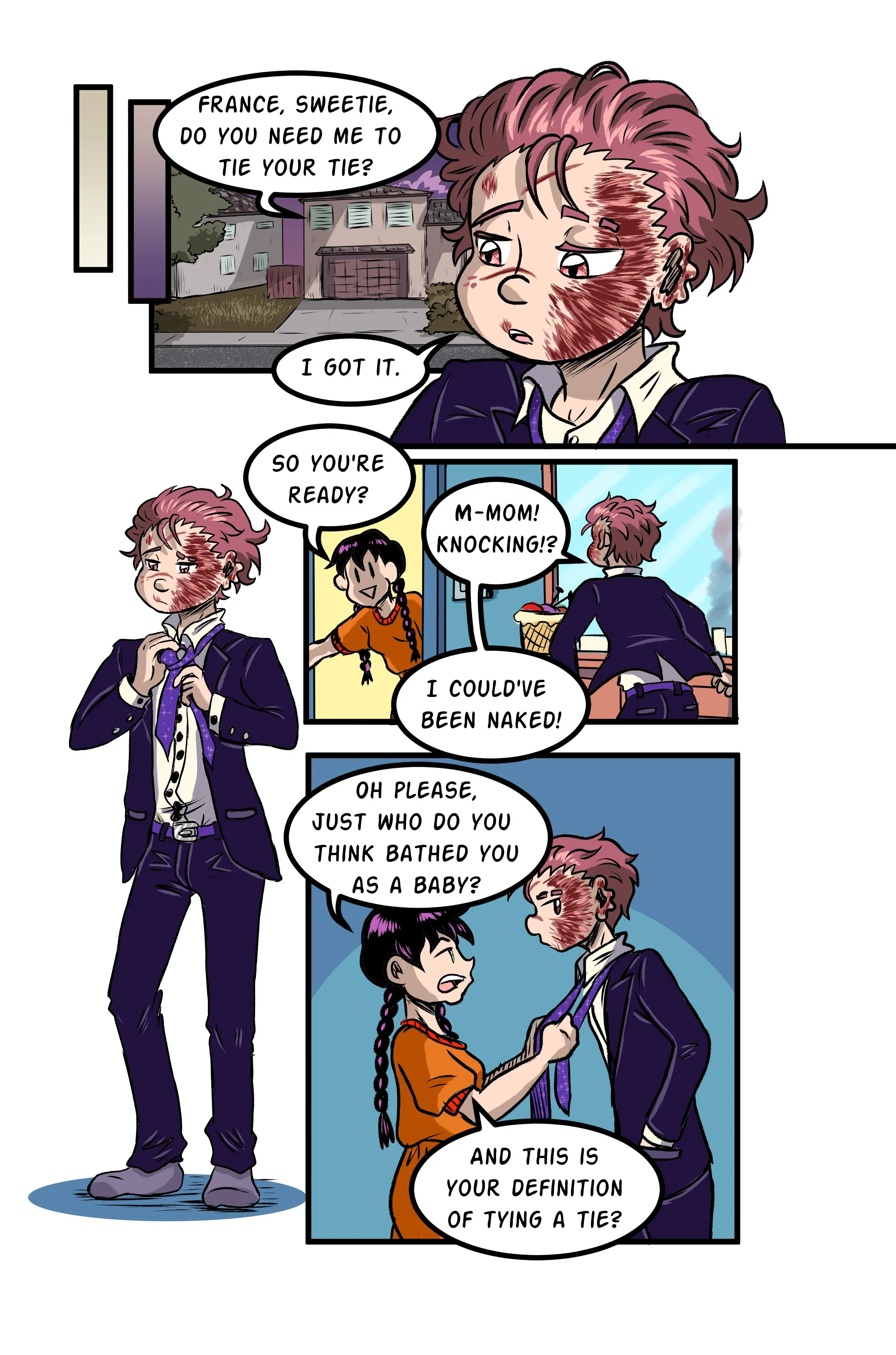
The story of two young boys, France—who mysteriously wears a cat mask—and Ken—who befriends him despite that. “My New Friend is a Cat” is a charming look at friendship, coming of age, and learning to take off the masks we all wear, both physically and metaphorically.
Sample Pages:


Process
Thumbnails


Sketch

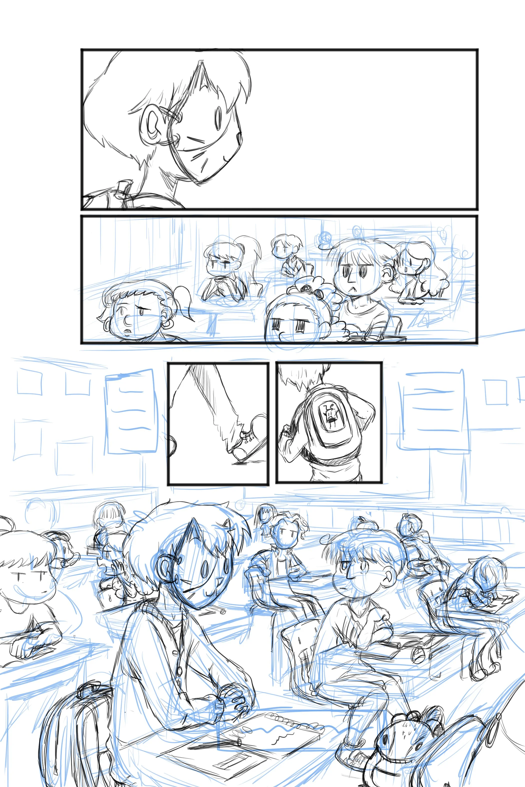

Line art


Color


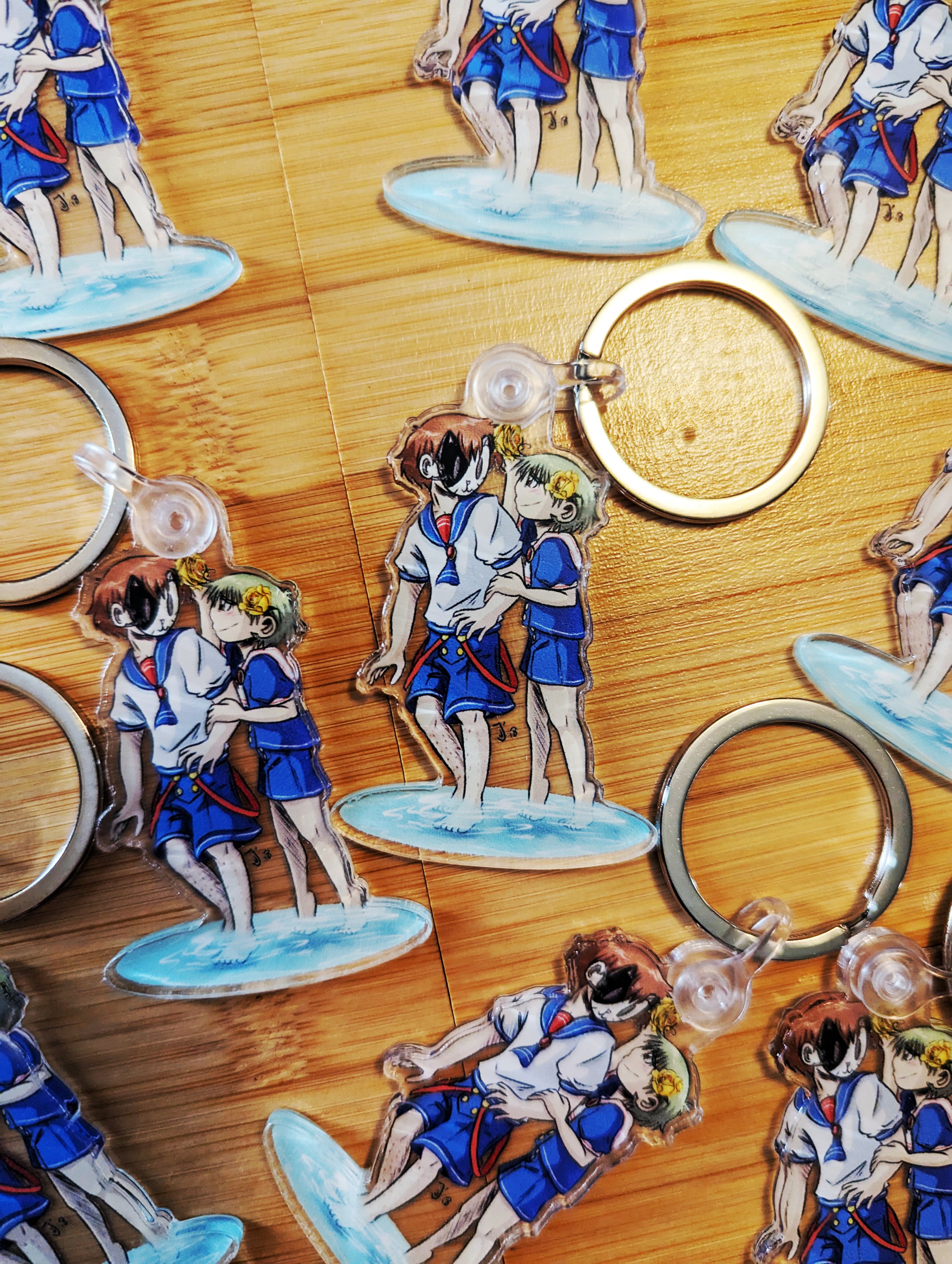
Social Media + Branding Strategies


“What’s Underneath the Cat Mask!?”
Marketing Re-Brand
“What’s underneath the cat mask!?” Is the tag line for the book launch re-brand!
While “My New Friend is a Cat” is primarily a webcomic, there was a demand by readers for a physical release. So, I took on the task of self-publishing the first volume!
The first run of the books had limited marketing, but with this re-branding the Ben-Day dots, bold lines, and a distinct font for the dialogue that are all hallmarks for the comic’s style were put front and center. It felt like any kind of branding that didn’t incorporate those factors would be misrepresenting the overall reading experience.
The tagline “What’s underneath the Cat Mask!?” refers to the main character, France, and the mystery surrounding why he wears a cat mask. In Volume 1, at least. In future volumes, it becomes clearer that masks are a motif, and France’s physical mask is just the starting point to discuss metaphorical masks to hide secrets and inner struggles.
Ideally, each character will get their own moment in the story to reveal what they’re hiding underneath their metaphorical “cat mask”, and the branding can feature them accordingly as the volumes continue.


Witty Announcements
Keeping the readers informed in the goings-on of the comic and me, the author, is a necessity. The “Witty Announcements” re-brand makes that necessity an overall positive and memorable experience.
Each announcement has its own unique preface akin to the funny taglines during the opening credits of “Futurama”. It keeps the younger audience of “My New Friend is a Cat” engaged and even learning new words, since the one rule of witty announcements is that one can not be repeated so I’ve got to exercise my brain sometimes to come up with ways to express the ideas I have.
The voice is meant to be youthful and conversational. Like getting a text from a friend or reading their social media feed.
The look of the announcements keeps the same color palette, font, and lines as the book launch branding, but scaled down to accommodate the vertical scrolling of Webtoon.com where the majority of these announcements are posted. Leaving most of the area white and “floating”, so to speak, makes for ease of transition from announcement to comic-content.
This style also transfers to the credits which show up at the end of each update.


Progress Reports
Ever since the comic moved away from weekly updates, I needed a new way to communicate with readers when a new chapter was coming. “Progress Report” became a way to do that!
Progress Report is simply a status bar with the 5 major steps I take to make an update of the comic and a cat icon indicating where I am in that process.
It’s a fun, easy, and visual way to let readers know where I am in terms of finishing the next update. The reader can get more and more excited as the little cat icon moves closer to the opposite side!
These posts are primarily for the Twitter (X) platform as opposed to Webtoon.


